Thursday, September 30, 2010

New Design Offering!


Hey friends! It has been a busy week, but I'm back now with a little announcement!

Many of you know I have helped some friends and family with different projects, including but not limited to a craft room, a master bedroom (almost reveal ready), a master bathroom, a laundry room and other miscellaneous projects I may or may not have blogged about. Wish you could afford to have someone help you decorate a fun and functional space that shows your unique personality? Now you can! For a limited time, I am offering Custom Room Plans for only $50! Each Room Plan would entail an image to help you visualize the outcome of all my recommendations for the room, along with an explanation of why I chose each element, where I found it and how much it costs. But I am not just going to tell you; I am going to show you.

Our friend Sara wanted a little guidance for her living room, and I told her I would use her as a guinea pig and make her a plan if she was interested! She agreed, and this is what I whipped up for her...


I was so excited when I showed it to her and she liked the plan! Well, except the rose pillow, but I still might convince her!

So, the plan would come with thorough explanations, descriptions and links, in a step-by-step fashion, so you can work on accomplishing the look gradually and affordably. That would look like this:

1. Paint, Curtains, Blinds & Lighting
The first step, paint (+ supplies= $60), will make the greatest impact, covering the alabaster walls with the warm gold color seen in the background of the plan, Benjamin Moore's Eye of the Tiger, # 188. That will warm the room right up! Adding the curtains (x2= 63.92) will bring our color palette from floor to ceiling, tying in the existing brown sofa and love seat, the new gold wall color, and bringing in the deep red Sara wanted to add to the space. Under the curtains, new wood blinds (x2= $109.98) would replace Sara's white metal ones, creating a rich, warmer feel. Adding the floor lamp ($59.99) will bring in a nice pop of that red, and provide a great additional source of light in the room for ambiance, as well as function as a reading light above the sofa.

2. Area Rug & Coffee Table
Adding an area rug ($99.99) will help anchor the seating area and bring in a deep taupe and some texture. The coffee table ($169.99) brings a structured, yet casual feel to the room, as well as providing storage underneath for books and magazines or a basket for remotes, gaming gear or DVDs.

3. TV Unit
Having a wide clean-lined TV unit ($199) will help anchor and balance the flat screen Sara plans to add soon, and provide plenty of storage for related equipment, including slots for cable and/or DVD components. The rich brown compliments the color scheme nicely.

4. Side Table & Lamp
A high-end-looking side table ($119.99) adds not only a place to set a drink, but also two storage shelves underneath. One more lamp ($54.99) balances out the light sources throughout the room and repeats the deep golds and browns.

5. Wall Art
A floral painting ($149.99) brings Sara's taste into the space and repeats the colors perfectly, while the gold-toned film reel ($29.99) and brown film reel ($39.99) reflect the movie watching that regularly takes place in the room.

6. Accents
While Sara is a self-professed minimalist, I couldn't help but recommend a couple throw pillows to finish off the design and bring in a couple last pops of that red. The paisley pillow ($34.95) ties in all the golds and reds again, while the felt roses pillow ($39.95) brings in a simple, yet luxurious element - it is my favorite piece in the room!

Total Room Cost: $ 1232.76

There you have it! What do you think? Wouldn't it save so much time, stress, indecision, running around, returning things and going crazy to just have a plan to follow? But what if I recommend something you hate? If you hated the whole thing, I would make you a new one, but the beauty in my plans is that you have the final visualization, and also the explanation of what each piece did for the room - if you hate something I picked you are armed and ready to find a substitute that still accomplishes what it needs to in the space! Also, if you give me a budget I will work with it, but if not and it comes in a little higher than you had wished, you can always wait out sales, use coupons or shop used to achieve the same look as outlined in the plan!

Since these Room Plans do take a bit of time to create, I am offering them at the $50.00 rate for a limited time, just to see if there is any interest out there. If you or someone you know are in need of this kind of help, now is the time - I would love to help you! Just shoot me an email at tashabrownfield[at]hotmail.com.

Thursday, September 23, 2010

What Susie & Mark have been up to...


This little one...


...is always bugging her brother - even when he is not waving suckers in front of her. She has to get in the way of whatever he is doing. He is taking it pretty well so far.

Recently, while he was napping, she wandered into her (child-safe) bed room and it got a little too quiet. Mom's, you know what I mean. When I checked on her I found her quietly reading...


Don't be fooled by that sweet smile - I was immediately attacked...


She set her baby blues on my camera with the speed of many gazelles...


By the way: a) she is balancing on her own two feet while inspecting that camera strap! and b) while my first child still has to be reminded that it is rude to point with his middle finger, Susie has that little pointer all figured out. She uses it for picking up her cherios, for inspecting foreign objects and for sticking into any hole she may find. Including peoples' mouths, sub-woofer holes and horse nostrils.

While we played we discovered she has grown into her Sandy Snail Rocker nicely (craigslist find - $20)...


She went crazy over that snail... really crazy...


She was making what her father and I call "sick pterodactyl noises" and jumping up and down and flailing her arms and stomping her feet and making faces that reminded me of the numa numa guy. Does that make me a bad mother?

And apparently she has not signed Oprah's pledge...


Don't do it Susie! Pullover and save a life!!!

Here's a random little nugget. Mark is into making scenes lately. He made this scene and wanted me to take a picture of it...


What is going on?! It looks like there is about to be a brawl!

There is going to be a brawl at my house if I don't start dinner. We are having meatloaf and yams and creamed corn. That is the last meal I had planned before I got my blood work back. My total cholesterol is within range but my "bad" was high and my "good" was low, so get ready for some healthier cooking, husb! I want to cut out fried and fatty stuff and start cooking healthier, but husb burns so many calories at work I think he might have to supplement my meals with donuts to keep from losing weight! If I am successful at any healthy new recipes, I will keep you posted but don't hold your breath!

Tuesday, September 21, 2010

Reader Poll!

Designers say "don't circle the wagons". This means don't have all the furniture around the edges of a room in a big circle. Here I am with big dreams of being a real designer someday, and I can't even comply with one of the most basic rules? I have been circling the wagons for about 6 years now. Not any more!!!

This was my living room before the change:


I "had to" circle the wagons because a) there is only one TV hookup, b) there is a corner fireplace, c) the couch only fit on one wall, d) there is also a wall heater to watch out for, and the biggest thing that bugged me, e) I had a fear of awkward space.

Here is my living room after the change...


Basically I switched the sofa and the chair, and slipped my desk from the bedroom behind the couch.


I think it feels much more sophisticated. And we really like watching movies together on the sofa looking straight ahead at the TV now, instead of the angle it used to be at. There are little things I would like to tweak, like eventually getting a less bulky chair and sofa that aren't so matchy-matchy, and making the whole room look more like this living room ;o), but I am happy with the change for now! How refreshing!

But, I want to know what you all think! Do you like the new sophistication? Miss the more open feel of the old layout? Have a new idea? All you non-commenters, now is the time to speak up!

Saturday, September 18, 2010

Coastal Living Magazine's Ultimate Beach House in Seabrook!


Sorry if you saw my accidental post on this - I only had a few of the pictures up and had an operator-error with my blog editor! I fixed it but those of you who use blog-readers may have seen it. This post is the real thing!


The Coastal Living Ultimate Beach House is part of the Seabrook community, in the Northwest Glen neighborhood, on the bluff overlooking the ocean. It will soon be featured in Coastal Living Magazine as well as on a local TV show, Evening Magazine. We finally bought tickets ($10 each) and rode our bikes down to the Ultimate Beach House on our last evening in Seabrook, and it was worth the wait!


What you see there on either side of the walkway are a garage and a private guest suite. How do you like this covered breezeway into the house? The interior design was by Tim Clarke Designs. Dreamy!


UM, outdoor fireplace and built-in outdoor kitchen on my front patio, on an ocean bluff with enough room to entertain everyone I know all at once? Okay!

Then there is the entry way / mudroom with mirrors along one wall and great built-ins along the other, with a place for everything...


I'm sold on the built-ins in the entry. Sorry about the photos- I needed to be less giddy and concentrate on getting more in each picture! Through the entry way, you first come upon this elegant but casual and airy dining area...


I love how the dining area, living area and kitchen are all completely open to one another. I have that even in my tiny house and now it is an absolute must-have for me. The living room was awesome...


Our tour guide told us Tim visited the area and photographed elements of the beach, coast, ocean and other surroundings and took those to a paint company who custom formulated the colors of the sea for this home! It feels like he furnished the home in the colors of the sea as well.

The kitchen was excellent...


I love that row of windows at the kitchen counter.


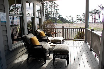
The dining area leads out to a spacious covered porch overlooking the bluff, with outdoor living spaces to either side of the french doors...


Just begs you to grab a book and settle in, right?

To finish off the middle level, we have another entry hall on the opposite side of the house, and a powder room with unique, charming fixtures and accents...


Next we headed upstairs to check out the bedrooms. First was a rockin' kid room...


Blues, orange, creams and charcoal? Unexpectedly cool.

The bathroom was neat, too, with some great tile, fixtures and accents...


Sorry I didn't get it from a better angle. That mirror-hung-over-window thing was throughout the house... I don't love the hardware on this one but I like the idea and the others were great. It is great to have that natural light for putting on makeup, too!

The kid room also shares a sweet spot with the master...


Not bad! Moving down the hall is the master suite...


It was spacious and sophisticated. This room and a couple others were outfitted in hand painted wallpaper - crazy! I loved the sliding doors, the little reading area and the bench outside the closet on the opposite side of the room...


The master bath was... ah-mazing!


The sea colors, the fabrics and textures, the crisp white linens -- yum!

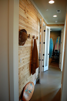
Next we went down to the main level, and continued down again to the lower level. The hall way was very nicely done in tongue and groove...


Again, sorry for not getting the best angle there, but there are three doors at the end; the one on the left leads to a restroom, shower, and sauna...


Yes, a sauna. I don't know if I have ever seen one in real life before! The middle door led to an exercise room but I didn't take pictures of it. The french doors on the right led out to this area...


I didn't take pictures of the lovely hot tub with privacy screens, but there you see the lounge chairs and convenient outdoor shower. Not to shabby.

Down the hall in the other direction was a bathroom and laundry room...


Remember my post on containers where I said to have the stuff that you use out and in pretty containers? Well, they even bought powder laundry detergent (does anyone really still use powder) and put it in a glass jar. See?


I love those green painted cabinets and had already decided that is what all the cabinets in my whole house will look like next time around. Mmm.

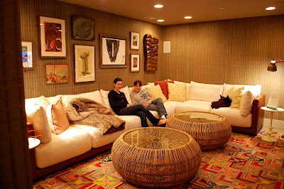
Last but not least, we found a killer TV room...


Look at those thick cushions! What a cushy place to kick back and watch a movie with the family. I loved the mod accents in this room! Leah and Serena were ready to kick back and watch a flick.

As we headed out we remembered we had not seen the guest suite yet.


It was an upbeat, yet relaxing little suite, with modern furnishings, a reading chair in a corner and sweet, beachy high ceilings with exposed white painted beams...


This was truly a guest suite, with its own private bathroom.


Tim Clarke sure did an amazing job on this coastal chic home. I really enjoyed checking out all the details and hope you enjoyed this enormous post about it! =) If you are interested, you can purchase the house for only about $2 million.