Thursday, April 29, 2010

Progress - Big Boy Closet


I finally get to blog about the transformation of this former crafting closet...


Into this unique and tidy big boy closet...


First I painted the back of the closet a color I pulled from the sheets on his bed. Then I purchased a closet rod and the brackets to attach it to the wall, painted it all white, and installed it. Then, I used my two shelves from the craft closet setup and mooched two more off Leah (she didn't need them right now), to create some free shelving.

Then I had fun arranging some art and decorative storage for some of his games, memories and clothing.


Kind of unconventional, but I like it much better than the store-bought white wire shelving that you get at the big-box stores that looks lifeless and cheap. And the giant Ryan Villopoto Motocross of Nations poster looks a little weird in there, but due to the dormers (?) there isn't enough wall space for it anywhere! And Ty and I brought it back for him when we went on a date, and Ryan is his favorite so it has to be in his room!

The main reason I am in love with this closet is for the balance it brings to the room. The room walls are painted in Benjamin Moore's Bar Harbor Beige, but the bedding brings in this creamy white, almost black, and the sheets are actually a charcoal gray with a dark denim blue hue to them...


Though it doesn't look like it in the pictures, the closet shelves repeat the creamy white from the bedding, the laundry basket repeats the almost black, and the closet walls repeat the denim-y gray from the sheets...


Again, it doesn't show well in the pictures, you just have to trust me. It echoes the bedding colors all together in one place, across the room, making it all seem as if it were planned that way! I love it when that happens!

I might add some curtains to the closet, kind of like YHL did for their baby girl here. He will probably need it when he becomes a teenager and doesn't keep such a tidy room! But I am still debating.

So what do you think? Does it work for an improvised big boy closet?

And a huge shout out to my dear husband for finishing the wood and coming to the rescue when chop-sawing and brad-nailing proved too difficult for me to plan around naps toddlers and babies! He finished the closet trim, replacing the red stained trim that didn't match the rest of the house!


Thanks Ty for all your hard work! You do a great job, even though you hate finish work!

Wednesday, April 28, 2010

The Yellow Church Cafe

Okay, Leah requested me and Mom's Sundried Tomato & Feta Pasta recipe several weeks back and I told her I'd get right on it. It turned out to be a lie. I decided I couldn't do it until I made a trip to the source. See, we copied the recipe after a dish from our favorite place to eat in Ellensburg, the Yellow Church Cafe. And that Yellow Church Cafe is worthy of a blog post.

And finally, me, Mark and Susanna treated Mom to lunch at the sweet cafe yesterday.


And it really was a church, by the way. You walk through those doors into a sweet and colorful cafe, full of touches of the church's history. It was built in 1923 for the German Lutherans. Churchy details abound, from the stained glass accents...


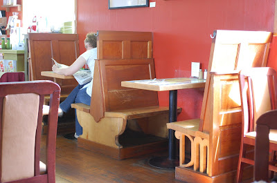
to the booths resembling church pews...


to the balcony dining area...


there are touches of old church style everywhere.

I love the bright colors, and the blue ceilings make it feel like a sunny day inside the Cafe. The kitchen is small and visible from the dining area. They also have an espresso bar and a selection of wines (the owners started the Ellensburg Wine Works).


Here is what the specials looked like that day...


Mom chose a soup and salad combo (I forgot to photograph), and I chose a delicious heavenly loaf to share with Mark...


You can't even imagine the warm, cheesy goodness steaming out of that loaf!

And a side salad...


And, the aforementioned Penne with Sundried Tomatoes & Feta...


And after all that, it still took much willpower to say no to these homemade treats...


They bake their own sweets, and I know from experience that they are devine! I recommend the carrot cake.

They also have a very nice selection of gifts and tea products from Tea Forte, which are super fun, especially if you know any ladies that enjoy a fine cup of tea.


So, without further ado, here is the much awaited Sundried Tomato & Feta Pasta Recipe I posted to TastyKitchen. You really should try it if you are a pasta person; it's really easy and quite good. And if it's not your thing, at least stop by the Yellow Church Cafe next time you go by Ellensburg, and give another one of their dishes a try - I am sure they will not disappoint!

Post Script- if you want to make it just like the Cafe does, here's PW's post on How to Chiffonade Basil. It was most helpful to me!

Thursday, April 15, 2010

Framed Arrangements - Consistency


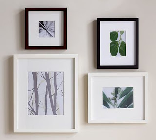
Okay, I had some mismatched frames in my bathroom, that I decided were bugging me. It didn't help that last time I got frames at Ikea I decided to get the uber cheap versions that you paint/finish yourself and I painted them with dull craft paint. Anyway, this time at Ikea I chose the Virserum frames, which are quite a bit nicer, and I think the consistency looks a lot better.

See for yourself...


The consistency really helps the pictures pop. You might want to think of streamlining if you have an arrangement that doesn't stand out like you want it to.

The only thing is, I have an arrangement planned for my master bedroom which I am loving for the fact that I am getting all the frames from thrift stores, and thus they will be mismatched. I might have to do a contradicting post when I get that put together!


Wednesday, April 14, 2010

Knock-offs!


Okay, I get flack sometimes when peeps see my Pottery Barn catalogs... friends, listen. I can't afford them either! But let me tell you, those catalogs serve an important purpose for me. They are a starting point. You look at them and see how they arrange things. How they layer rugs, furniture, lighting, accessories... and yes, inevitably, you will see something in them that says "You know you want me." And you will think you won't be able to fight it. But, you have options. That's when you let that image be burned into your mind. Embrace it. Cut it out and keep it somewhere. Now arm yourself with some patience, and some perseverance.

I am convinced that there are designers working for Target, WalMart, Ikea and others, who's sole purpose is to see what's hot and knock it off. Or at least their designers take a freebie and slip in a knock off now and then, that they know will sell like hotcakes. You just have to hunt them down and take them for your own.

Here are some examples... Enter Pottery Barn Holman Ledges.


They start at $35 for the 2' version (also available in 3' and 4') and come in a brown and black. That's decent for PB, if you ask me, but is there a better deal out there?

It's late, I'm lazy and I have PB and Ikea catalogs in front of me, so...

They come in 21", 45" and 72" lengths and black or white. They start at $9.99, folks! On the small size that is a savings of $25 - on one ledge! That works for me! In fact, I put one next to Mark's bed for a quick, cheap and easy night stand alternative to hold some books.

Let's see what else I can find...


See the one on the top left? It holds a 4"x4" photo. It is $20 regular price (on sale now for $16).

I know lots of stores have this style frame, but I'll go with Ikea's Ribba Frames.

They come in black, white, or brown and various sizes. The one that holds about a 4"x4" photo shown above is $9.99. That's half price! See? This is easy.

How about these Natural Fiber Rugs from Pottery Barn?


OR, how about these Egeby rugs from Ikea?
Both PB and Ikea's versions are sisal, trimmed in cotton and come in a variety of sizes and colors. Let's compare prices.

The PB versions: 5'x8' on sale for $249, or 8'x10' on sale right now for $449.
OR, the Ikea versions (closest in size): 5'5"x6'5" for $99.99, or 6'7"x9'10" for $149.00.

That's a savings of $149 on the small size, or $300 on the larger size! I'll take Ikea's any day of the week, ladies!

Let's move on to bigger pieces...

Here is PB's Farmhouse Dresser.


Here is Ikea's Hemnes Dresser.

Now, I know you all will argue and say PB is better quality. In this specific example, it is. Ikea's main construction is solid pine (a softer wood), while some of the construction of their drawers include the thin press board. PB's is solid mahogany, and I haven't seen their drawers. But, I will say, I recently used PB's Bedford desk in the MIL's office, and it is pure MDF and chips very easy, so the quality isn't always so much better with the high-end stores. Plus, if you are like me, you can't afford the PB version anyway. So if you are going to have to settle for something cheaper, you may as well get a knock off with the same look as you were dreaming of, right? I'm okay with that.

One more. Here's PB's Flat Braided Jute Rug.


Now, here's Ikea's Tarnby flat woven rug.
Sure, Ikea's version is missing some of the detail and maybe a tad less chunky, but is that detail worth $300 to you? I can live without it to save $300.

The point is, if you can afford the high-end stuff, that's great. If you can't, there are still ways to get that look you want for less. The first thing I recommend is to sign up to receive the catalog of the store you can't afford. Get to know them. Get to know what you love. Then start looking for it in the world that contains your price range, whatever that is.

Some of my high-end faves are Pottery Barn, Crate & Barrell and Williams & Sonoma.
Some of the places I look for knock-offs are Ikea, Target, JC Penney and WalMart.

Go find knock-offs!


Friday, April 9, 2010

Decorating with Containers


Okay, I've made mention of this before, but I am going to say it again: the main theme I see in Martha Stewart's amazing decorating is having the stuff you use out, and presenting it in pretty containers. That's it. And I'm dedicating a whole blog post to it this time.

I have these three books by Martha Stewart: Good Things for Organizing, How to Decorate and Good Things, and I like them all (though I admit I flip through them for quick inspiration, more than I actually read them). But, even if you just click those links and look at the pictures on the covers, you will see a little bit of what I mean. Even when she does put something out for decoration, it is usually something with function like glazed clay vases or serving platters.

I decided to show you how easy it is for you to decorate like Martha, by showing you a few of the ways I have found to have useful things at the ready attractively around my humble house...


See? Easy, right? Well, it didn't come naturally to me; I had to learn it. When I first started keeping house at the mature age of barely 19, I crammed everything useful out of sight, and filled the counter and display spaces with useless decorations. The result: clutter. Surprising? It seems to me like it would look more clutter-y with all your every day stuff out, but man I have sent so many useless decorations packing over the last few years, and I feel much less cluttered now. And the things I use are within easy reach! Plus, I am not so desperate for storage, because having some items out means more space in those drawers, cupboards, pantries... and everywhere else we usually hide stuff!

So try it today: find one thing you use regularly, that you have hidden away. Find a nice container it fits in. Put it out. See what you think!

DIY Art


I know, I know - it's been a while! I would like to officially declare that my only goal in life right now is for Ms. Susanna to sleep through the night and me to get my brains back! I'm also at a standstill on household projects, thus without much to blog about - don't even get me started there. I do have a few posts to do over the next few days though, so here goes with the first...

I am already working with Mark on his alphabet, and saw these cute alphabet prints by Penny People Designs that inspired me to make my own...


If you have any simple Word or Photoshop skills, you can make your own! No matter your skill level, you can do it! Just keep it simple if you have to. Or, frame a verse, quote or a single word!

Another idea: use a photocopier instead and make one of these super easy monogram prints like Young House Love did...


Anyway, I decided I wanted to make a print showing the entire alphabet, and since I am OCD, I wanted all the letters to be plain, simple and accurate. I found a free font I liked on Dafont, called Writing Stuff. If you don't know how to download fonts, foggetaboutit! Just use the ones you have in Word. You don't have to be fancy or technical to make something cute.

Once I installed the font I had downloaded, I typed out the alphabet, formatted it the way I wanted, and saved it. You need to save it to something portable (CDR or thumb-drive) because you are going to want to take it to a print shop to have it laser printed in color and on nice paper to really get a good look. Or you could call the print shop and see if you can email it to them.

Note: If you do download a font, chances are the print shop will not have that font. You need to be sure to either save the file as a PDF (it's like an image rather than text data) or be sure to also save the font with the file, and the print shop can download it too, to be sure your artwork comes out just as you designed it!

After I had the art printed at my local Ben Franklin, I chose a cheap Ikea frame, and, wa-la!


I need something else to bring in some texture on the dresser, but I like the print there, I think.


Plus, it is an educational reference and piece of artwork in one! I chose to do the vowels in the accent color I used in the room...


What do you think? Wanna DIY some of your own art?

Okay, on a totally separate subject... I just have to say, Mark got a new toy that is wrong in so many ways...


Not the least of which are that I am the one who bought it for him (dollar bin at Target), and I also bought him a gi-normous bee, grasshopper and dragon fly. Sick.