hey y’all.
I was absent here on the blog yesterday because I was spending some time retaking some photos for my Etsy shop and updating the listings. It was mainly the camera strap covers and totes photos. I also added a shower curtain I made from a vintage sheet. Anyway, through reshooting those pictures, I noted a few things that I could share to help you all get better photos when dealing with natural light and some tips for taking photos for your items for an Etsy shop or other online sales.
I compiled 5 tips to share…
1. Always use natural light.
I like to use natural light for two reasons.
First, natural light and indoor (incandescent of fluorescent) lights have two different temperatures which translates to different colors in your photo. This would look like a part of your photo being very blue (outdoor light) and another part being very orange (indoor light). Your camera cannot correct for two different light temperatures in the same image. It is easier to turn off indoor lights and use light streaming in from the window than it is to try to eliminate light coming in from the windows and use only indoor light.
Secondly, light from an indoor source is going to be coming from a smaller point (the bulb) and thus make more harsh shadows than the light streaming in your window which is as if the entire window area is one large soft light bulb.
If it is a cloudy day, outdoors can be great for photos, because again, the whole entire “cloud” above your head is one huge soft light bulb. If it is sunny, you would want to either shoot in a shaded spot (there should still be plenty of light bouncing around but it will be less harsh) or shoot indoors next to a window with indirect light (and you may need to see tip #2!).
2. Use a reflector to combat the “dark side”.
So turning off all the indoor lights and using light streaming in from a window is going to create what I call “the dark side.” Here is an example…
That dark area is undesirable, but if you were to make adjustments in camera, the light side would become blown out, or over exposed. To remedy this, use a reflector or a $2 piece of white foam core to reflect light from the window back onto the dark side of your subject, (without even changing camera settings) and you will get this…
Better, right?
Here is an example of what that setup looks like, while I was shooting another item:
It is really simple. The foam core takes on the light from the window and bounces it back onto your subject, acting as another light source. Foam core usually costs around $2 for one sheet and you can find it on the school supply aisle of Target, Fred Meyer or craft stores. If you need a quick fix, you can take a piece of white paper and paper clip it to a piece of cardboard or a cereal box! Just make sure to use white, so your item isn’t getting another color reflected onto it, and changing the apparent color of your item.
3. Angle
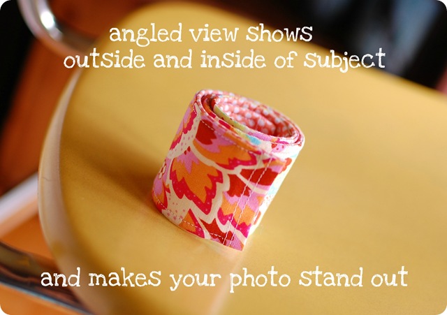
So another thing I try to pay attention to is the angle you are shooting your item. When selling something we might be used to the left side, right side, top and bottom straight-on views. But keep in mind that by changing the angle, not only do you make your photo stand out from the rest, but you can show more of your item as well.
Here is an example:
There are two angles going on here, by the way. One is that I got up higher, to “peek” over the front edge and see that inside fabric. The other is that I tilted the camera angle to be diagonal, which is a popular trend right now, but on a page of straight on photos, can still help your item stand out from the rest. For most online sales, you are limited to about 4 to 5 images of your item, so get the most out of every one!
4. Display
Display is also very important. The above example is a camera strap cover for DSLR cameras. If I only showed that image, it might be hard to understand how the item works and how it would actually look in use.
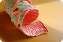
For each item, I try to show different angles as well as display the item in different ways. Here some other photos I included with that listing…
First, I showed a compact view of the item. Second I showed the item in a similar way to how it would look in use, hanging on someone’s neck. Thirdly I showed a different view, which shows more of the fabric pattern and makes the inside fabric more visible. And fourth I showed a close up of that inside fabric (and forgot to use the reflector, by the way, can your trained eye see that “dark side”?). In my camera strap listings I also show an “example” photo of one of my strap covers installed on a camera strap, so the buyer can see the finished look.
I like to stay away from too much “staging” with other items which can lead to confusion about what comes with the item. For example, if I pictured this on top of a neat little vintage tin, it would be cute, but I would surely get convos asking me if the tin came with the strap. It is more clear to just pick a neat backdrop like my schoolhouse chair, an old wood deck or table, or even grass or moss or rocks outside in the natural light!
5. Cropping
My last tip today is cropping. Two parts here.
First, be sure to crop your picture in an effective way. In the first of the four photos above, I made sure to leave room around the subject, not “chopping” any part off, so the eye is not confused and is drawn to the object as a whole. In the last photo, however, I was drawing attention to that inner fabric, which is in focus, and that outer fabric is going out of focus, so in this case it was okay to crop out some of the object and let the eye go to the part in focus (this is easier to see in full size on the listing). Both are fine, just be conscious of your cropping. Most listings will end up with some of each because you will want photos of the whole item and close-ups which are likely to have parts cropped out.
Secondly, for Etsy, in the gallery photos people will see when viewing your shop and when searching for items, the ends of rectangular images are cropped, which can cause your potential buyer to see a less flattering image of your item. I will use an image from above and show you, if that were the first in my series of images in my listing, what buyers would see…
That said, the image is fine when someone clicks on your item and is looking through the picture gallery there; you just need to make sure that the first of your images is one where the cropping won’t make the image less functional, pleasing or eye catching!
So I hope these tips are helpful to those of you who have goods to peddle, and I think even any of you interested in photography can find something useful here for whatever it is that you photograph!
By the way, I have read a couple good photography posts lately: here is 5 tips for great outdoor photos and 5 tips for great indoor photos on A Beautiful Mess and there was another on making a foam core tee pee for shooting small objects but I can’t find it so I guess you will have to live without it.
Godbless!


No comments:
Post a Comment